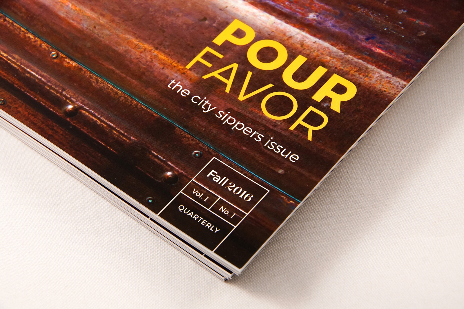
City Bound is a progressive magazine which promotes the cultural renovation of the city of Sacramento, with a strong interest in maintaining historic traditions. A quarterly magazine on local Sacramento culture with rotating content, the first issue of City Bound focuses on craft beverages and the passionate individuals behind them in our community. Written and photographic content was created by a team of designers to showcase the concept and design aesthetic as defined during the research process.
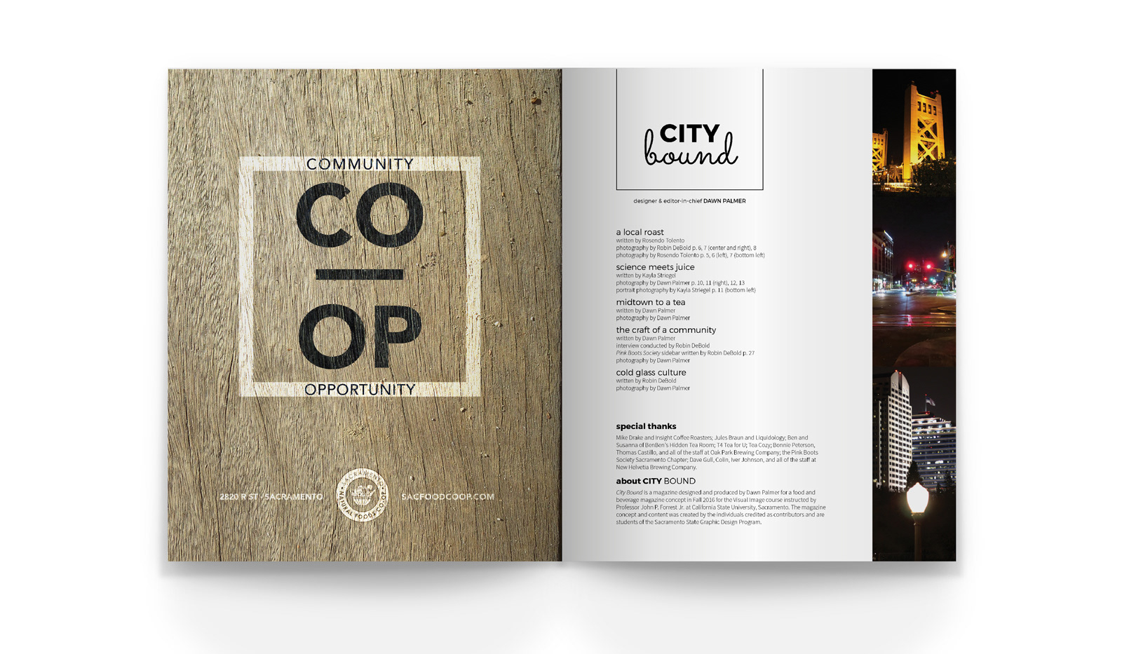
The contributors consisted of the following individuals in the Graphic Design program at Sacramento State during the Fall 2016 semester: Dawn Palmer, Robin DeBold, Kayla Striegel, and Rosendo Tolento.

CONCEPT
During the research phase, the team observed a current social movement in Sacramento aimed to retain residents locally and bring outside traffic to Sacramento. Through local commerce, expansion of the arts, and renewed interests in community building events, Sacramento residents are emotionally invested in the cultural renovation of their city. Due to this trend, the magazine is titled City Bound to reinforce the prominence of Sacramento as a key point of destination.
The audience of City Bound focuses primarily on:
– Males and females between the ages of 21 and 35
– Those living in and around Sacramento County
– Individuals with an interest in strengthening the social impact of Sacramento
These individuals believe it is important to be part of their local community, to buy local produce, and support local business owners. They are young progressives eager to improve the cultural diversity and emphasis of Sacramento.

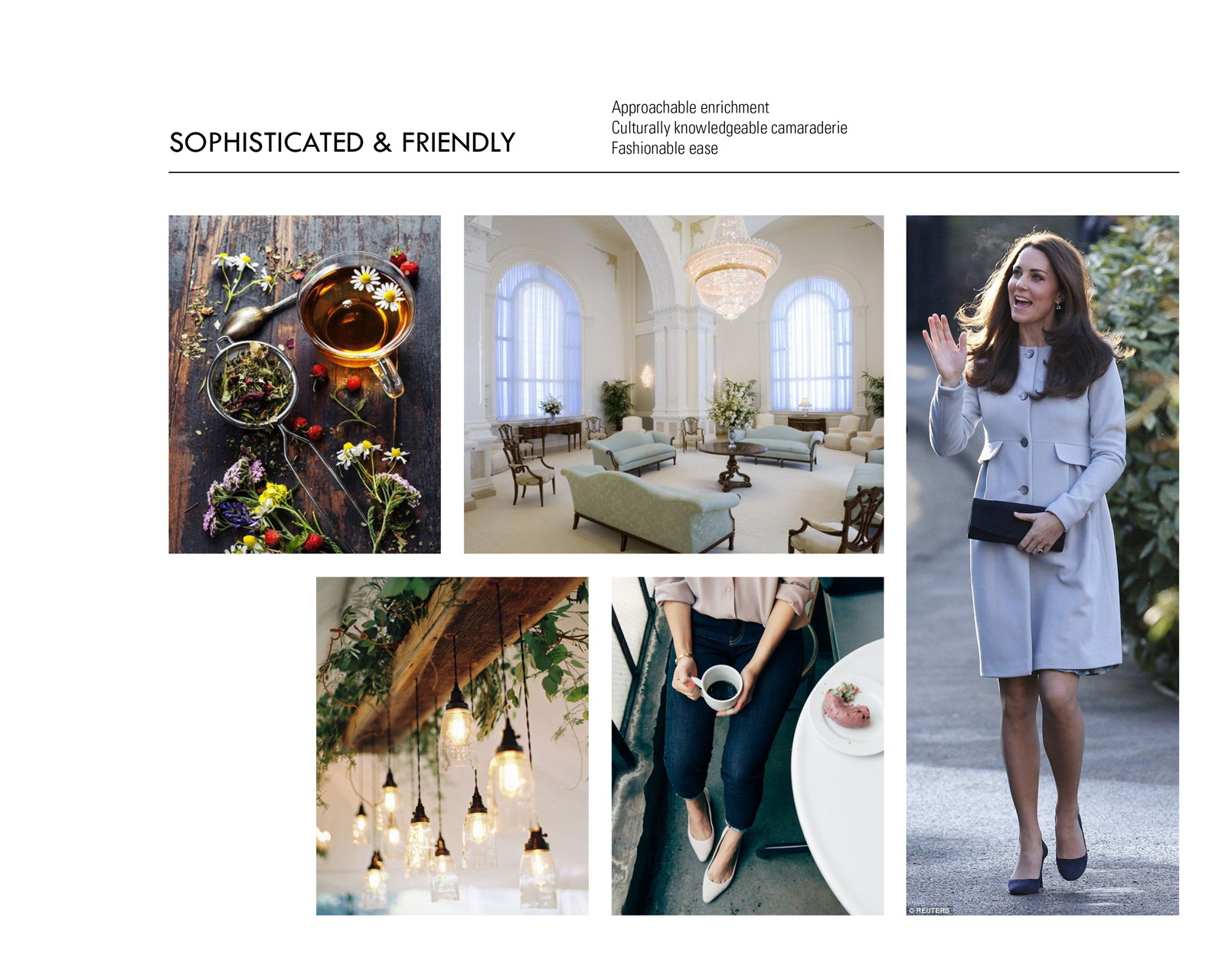
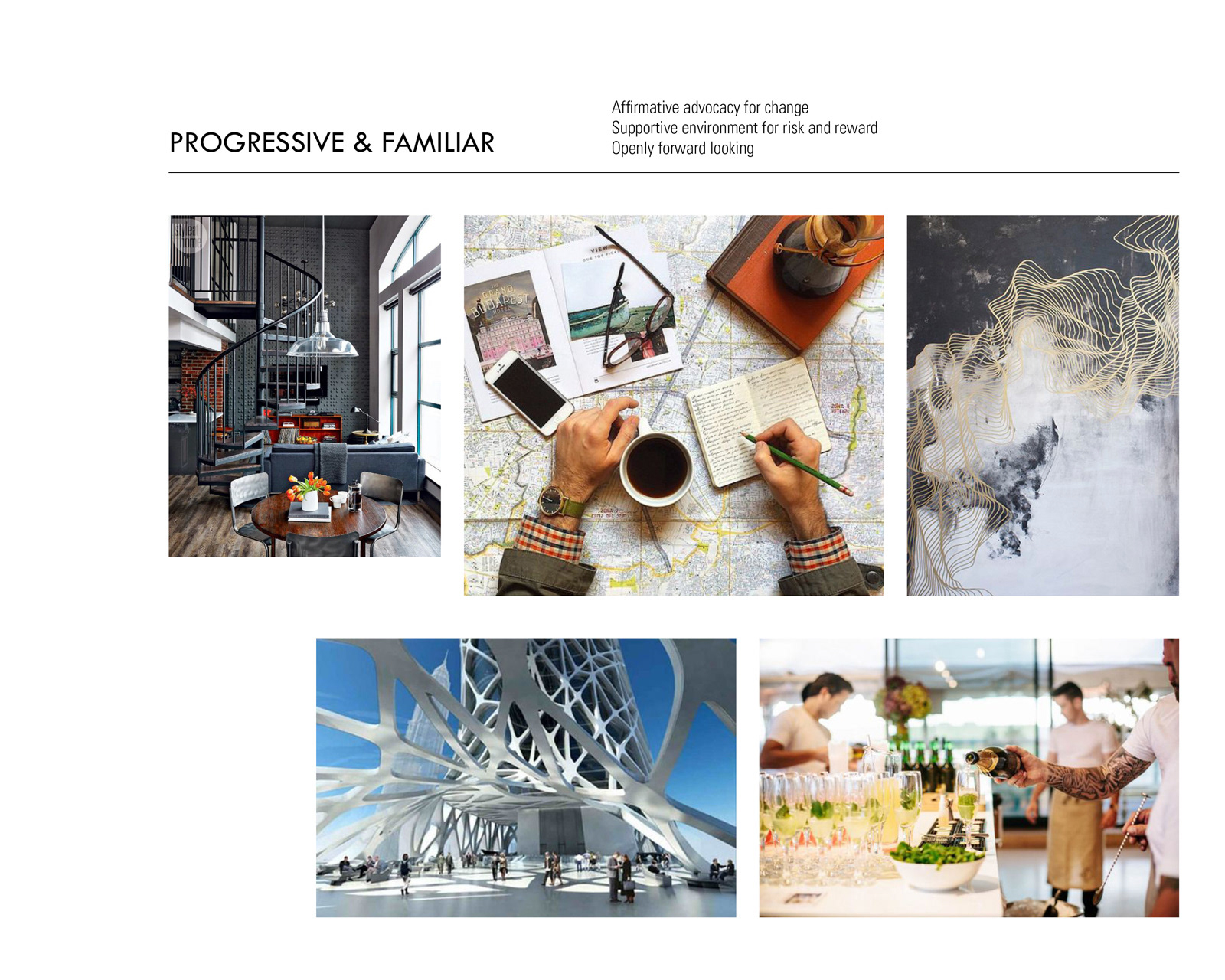
MOOD BOARDS
After defining the concept and audience through the research phase, the team collaboratively created the mood of City Bound to communicate the aesthetic which would inform the overall design direction for the individual designer's interpretation of the concept.
SYSTEM & FORMAT
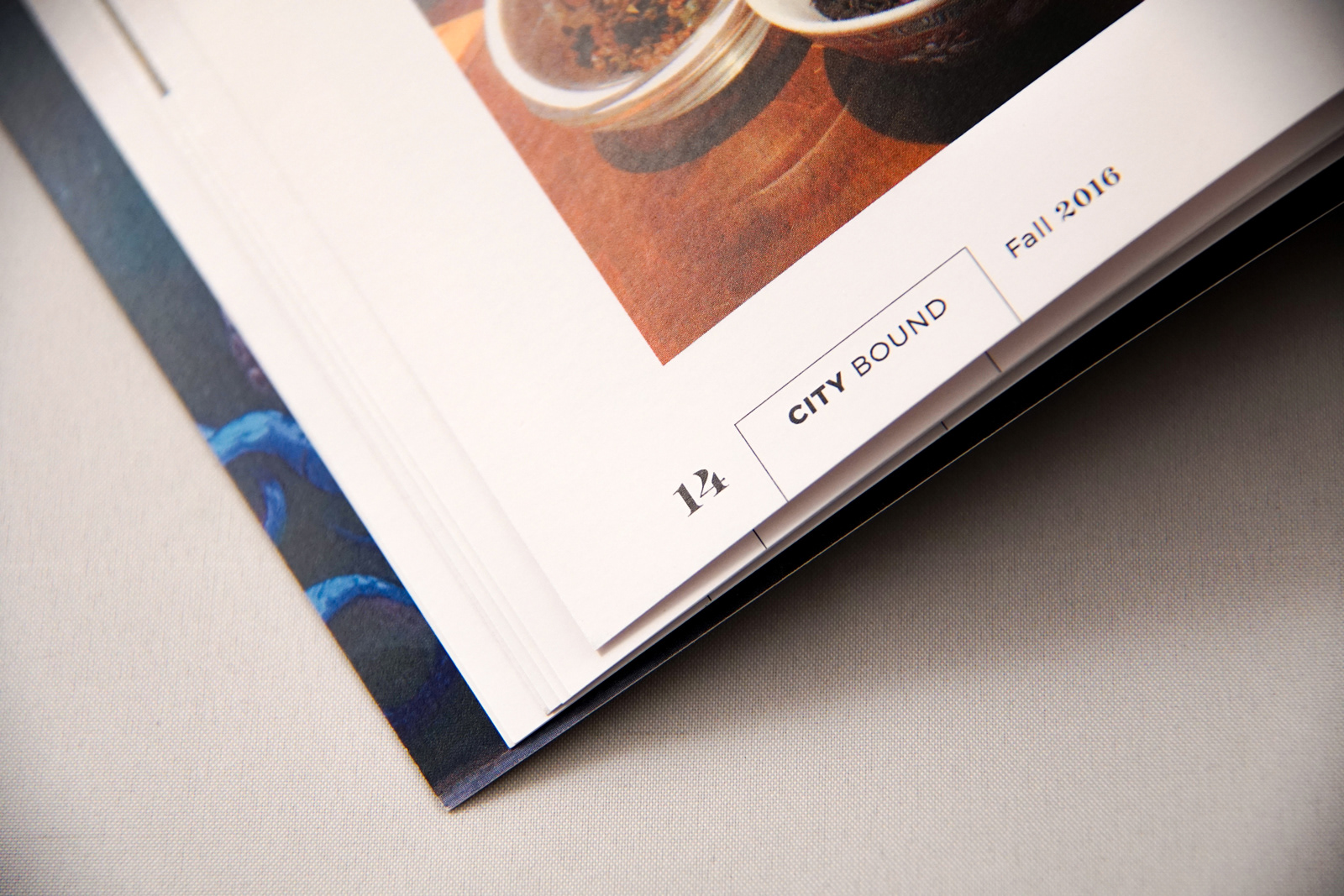
System elements of the magazine are highlighted within box line graphics to relate the reader to the title of City Bound—the line is a directional boundary, similar to the use of line borders on a map, yet also alludes to the concept of home. The typography of the primary system mixes the typefaces of Montserrat, Sacramento script, and Majesti for numerals, to allude to the artisanal culture growing in a progressive community.
The 8"x10" magazine is perfect bound and printed on silk paper to showcase the large volume of photographic content. City Bound focuses primarily on high quality photography to connect the reader with the magazine's value for authenticity.


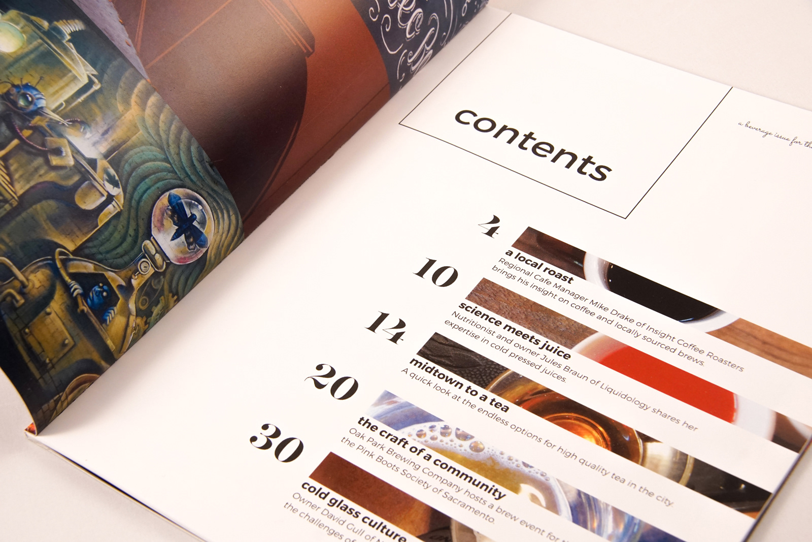
CONTENT
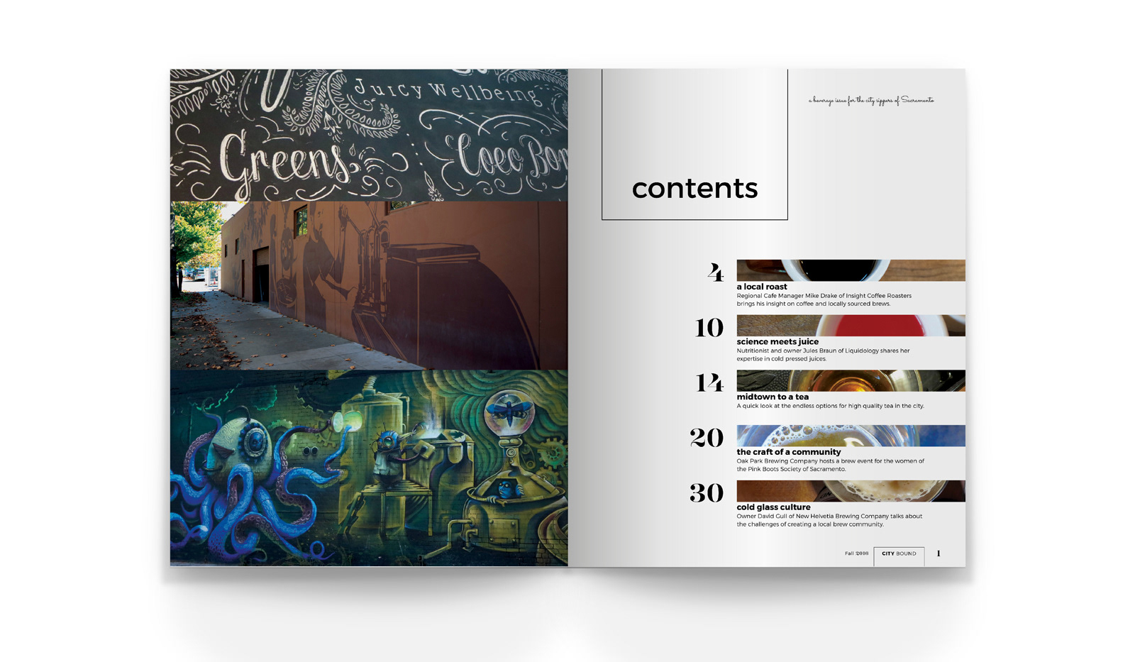
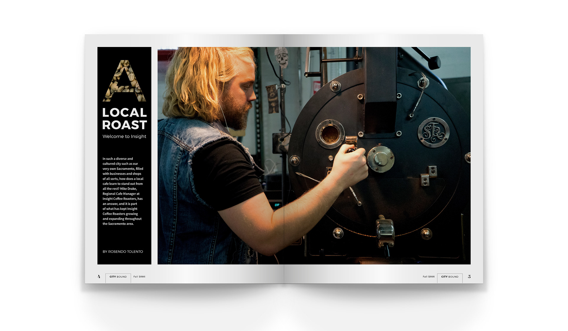
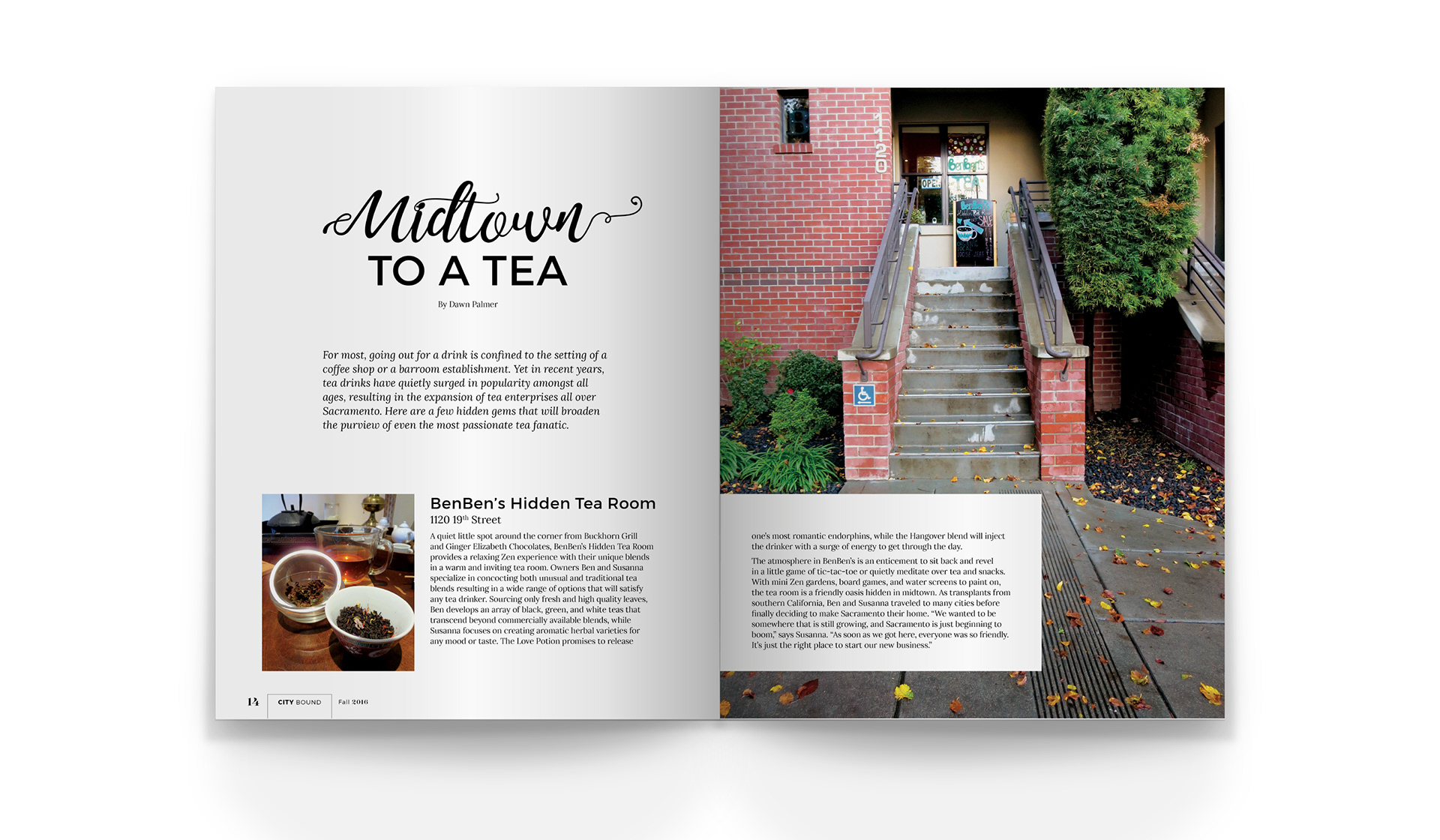
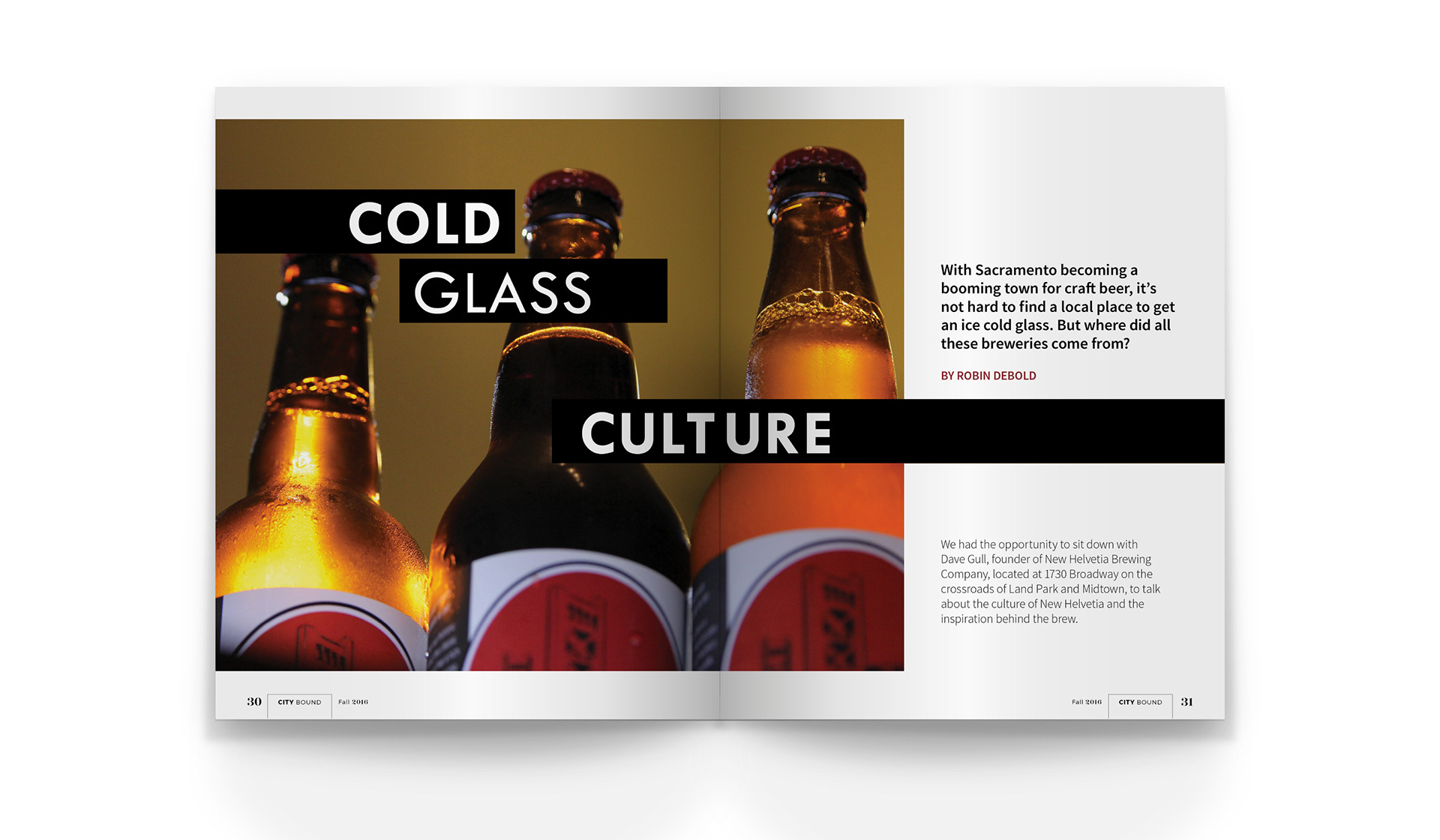
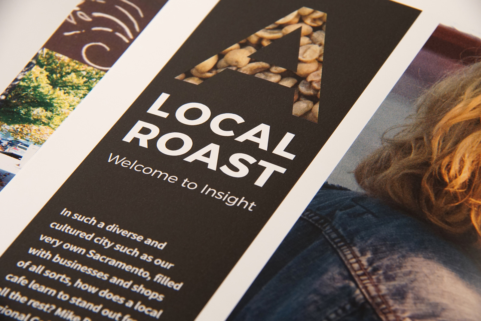
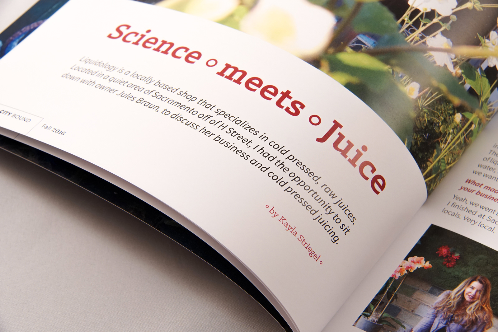
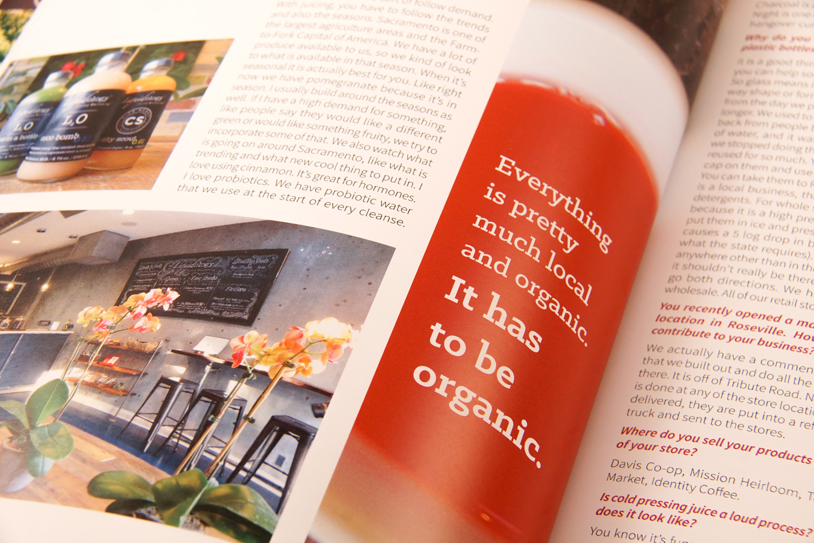
To evoke the feeling of a day in Sacramento, the subject matter sequentially follows from day to night—in terms of typical beverage choices, coffee to juice in the morning, tea in the afternoon, and beer in the evening. The articles featured in City Bound are each set with typography and system elements which are unique to the character of the content. Using details within the typography and structure, the graphics seek to compliment the personality of the individuals and their places of business to further connect the reader with their Sacramento hometown.
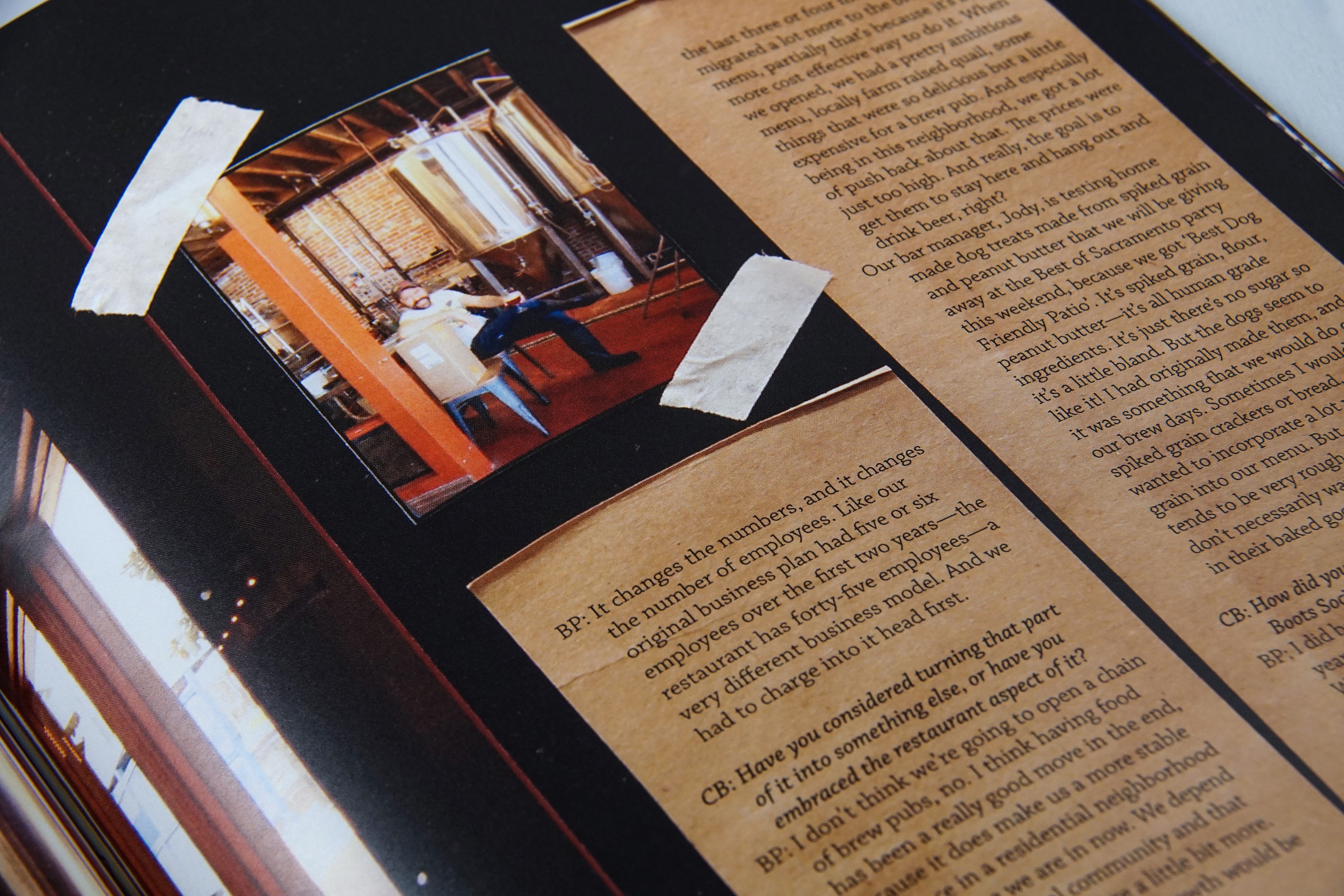
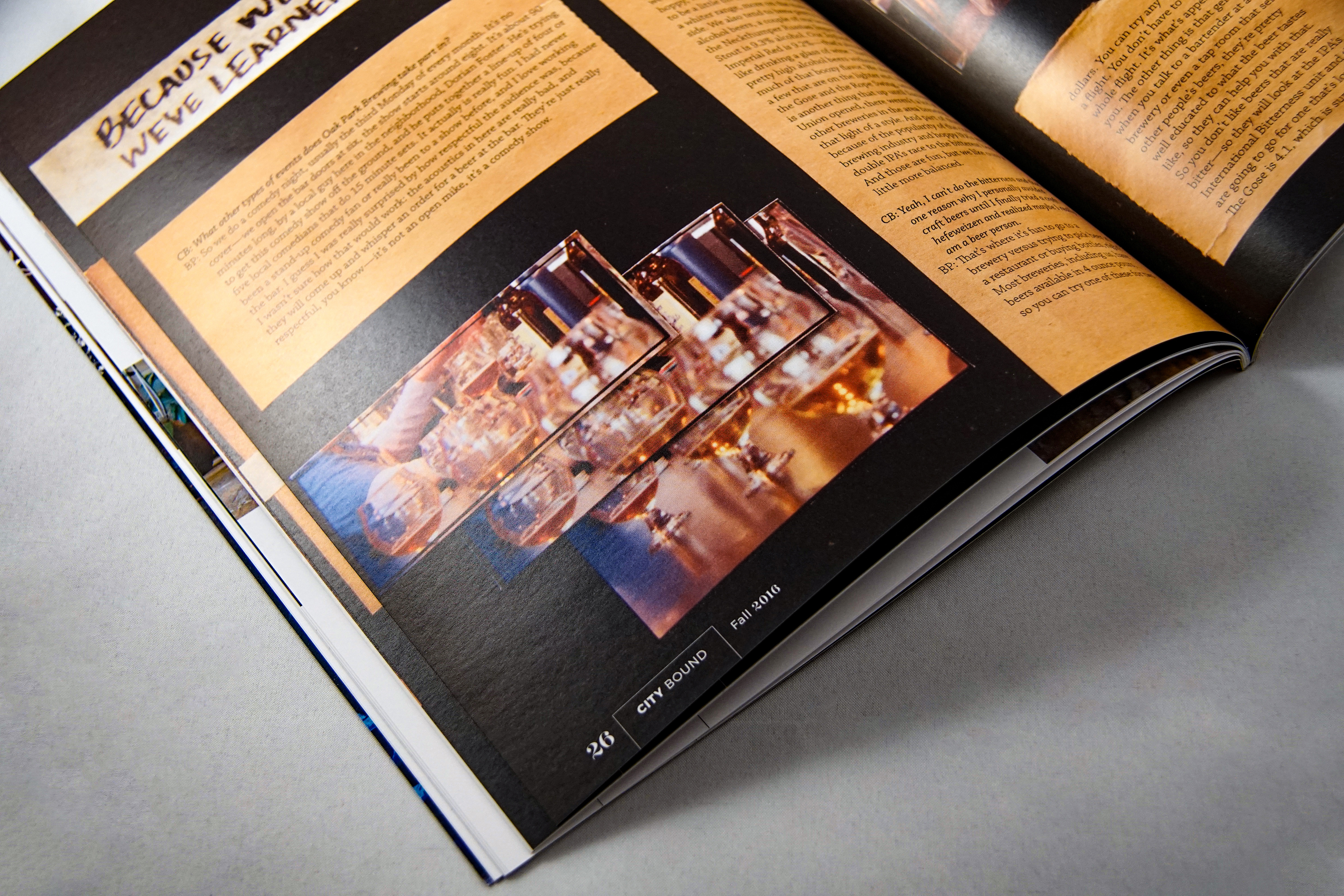
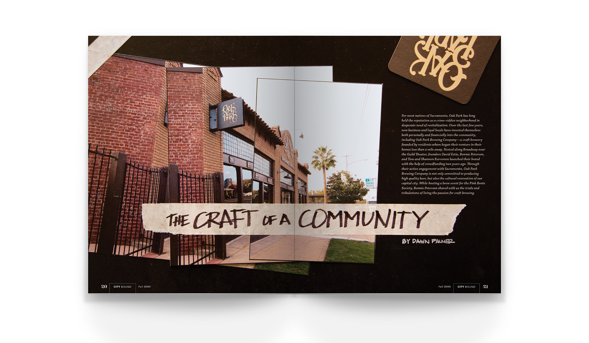
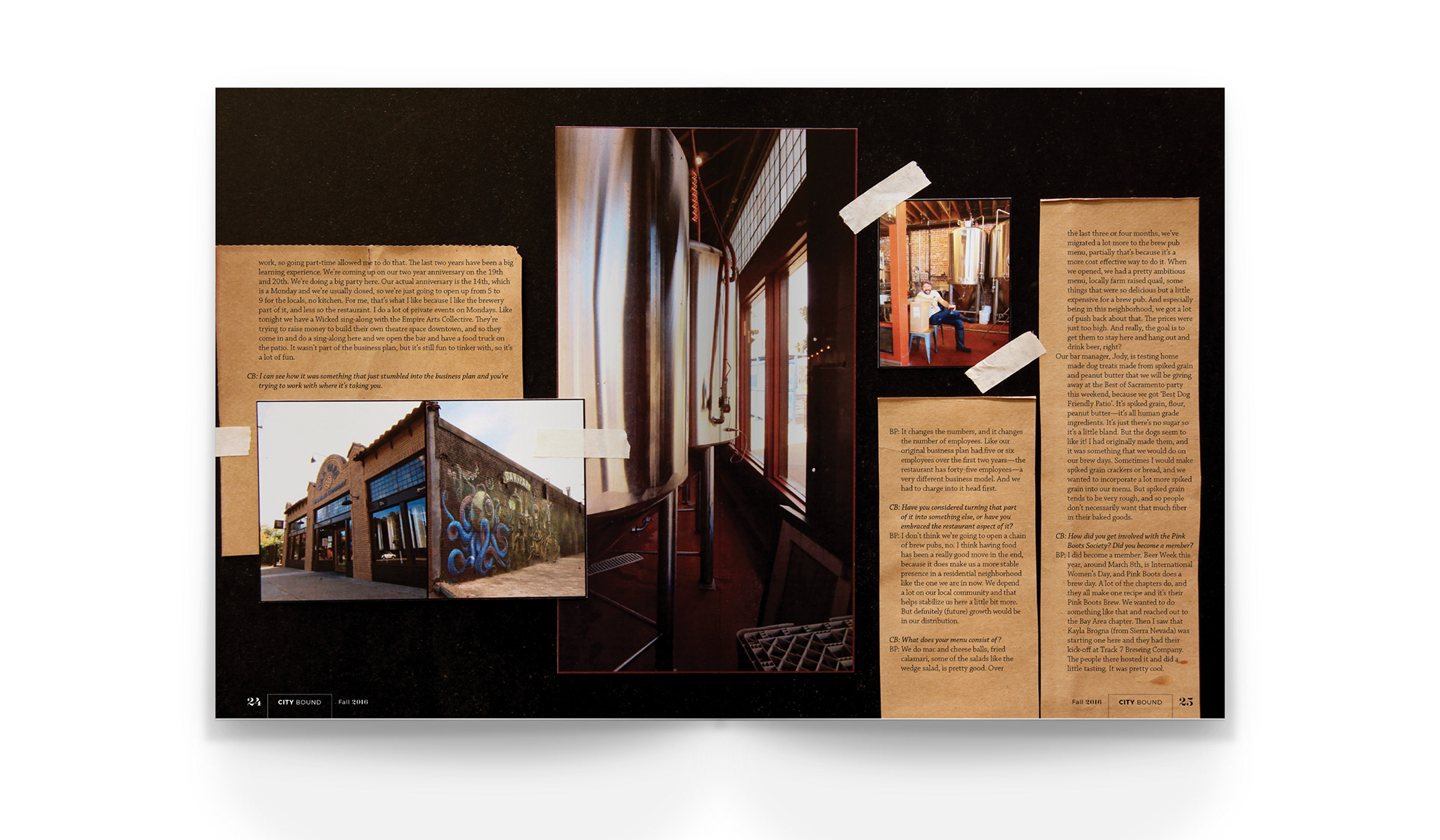
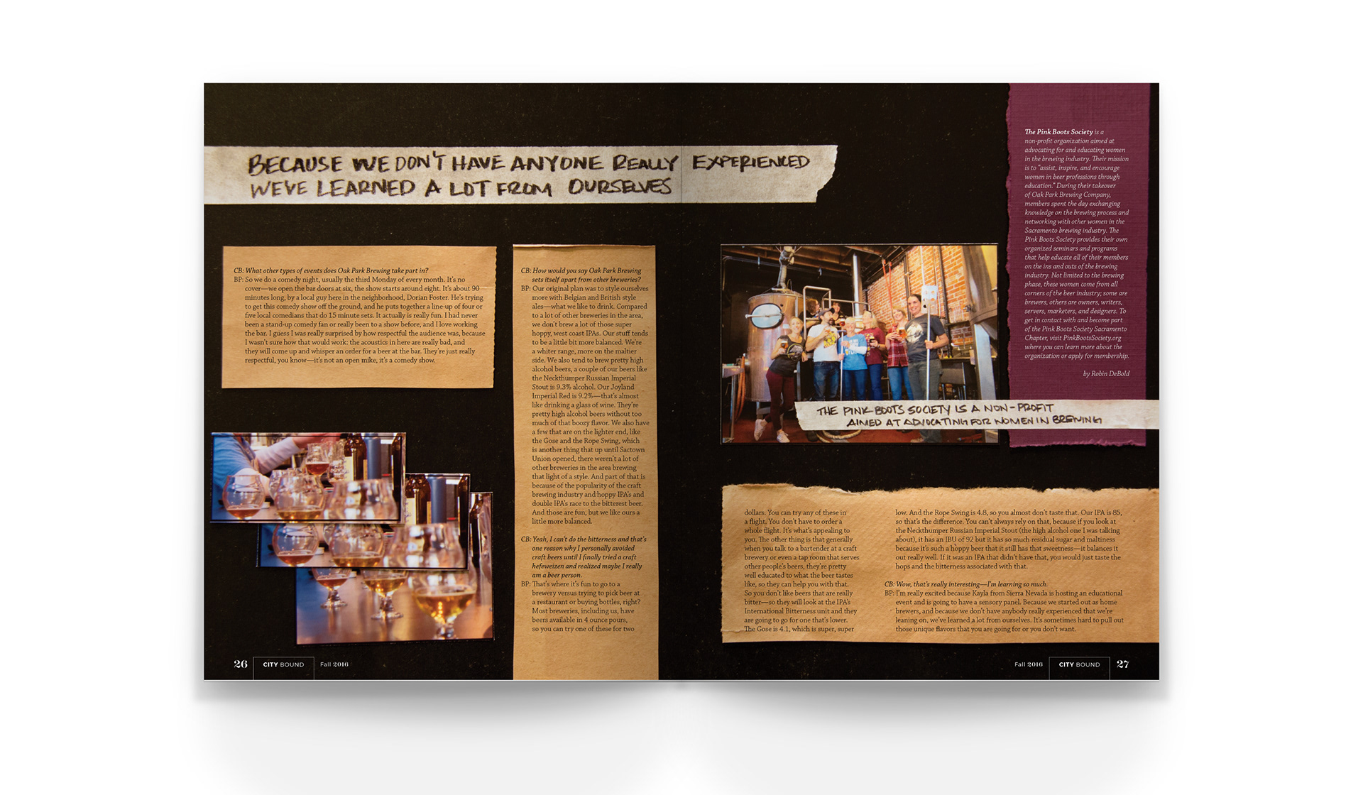
THE CRAFT OF A COMMUNITY
To speak to the hands-on nature of the work accomplished by Oak Park Brewing Company, the article is composed using photographic prints, masking tape, cut-out craft paper, and handwritten titles placed on a large black chalkboard. The article text is then laid over the composed areas after the spread is photographed in full, lending a subtle dimensional quality to the overall aesthetic.